Brand Guidelines · v1.0
Cool Girl Wears x Sienna Espie
Melbourne
Cool Girl
Wears.
Visual identity system — typography, colour, layout, and editorial rules.
Brand Guidelines · v1.0
Colour System
01
01APrimary palette
The brand's default canvas
The primary pair is cream and deep brown.
Warm, editorial, timeless. These two colours should carry almost every major brand surface.
Cream
Primary · Background
HEX · #F8EBDF
RGB · 248 · 235 · 223
CMYK · 0 · 5 · 10 · 3
Deep Brown
Primary · Foreground
HEX · #633923
RGB · 99 · 57 · 35
CMYK · 35 · 70 · 80 · 50
Brand Guidelines · v1.0
Colour System
02
01BSecondary colours
Support neutrals and one rare accent
Use secondary colours to add depth, not noise.
Cream Soft, Brown Warm, Brown Ink, and Blush extend the system. Blush is an accent only: markers, hairlines, and small moments of emphasis.
Cream Soft
Support · Surface
#F2DFCD242 · 223 · 205
Brand Guidelines · v1.0
Typography
03
02ADisplay typography
Playfair Display
A serif for voice.
DisplayPlayfair · 400 · 88-168 / 86 · LS -6.5%
Cool Girl Wears.
H1 / HeadlinePlayfair · 400 · 56-96 / 95 · LS -2.5%
Welcome to Cool Girl Wears
H2 / SubheadPlayfair · 400 · 40-68 / 100 · LS -2.5%
A street-style fit check series.
LedePlayfair Italic · 400 · 20-28 / 135 · LS -0.5%
Showcasing personal style through organic, on-the-go fit checks filmed on-location across Melbourne.
Brand Guidelines · v1.0
Typography
04
02BFunctional typography
Inter and JetBrains Mono
A sans for clarity.
BodyInter · 400 · 15-17 / 160 · LS 0
Every feature is a complete content package — reel, imagery, and native brand integration across both audiences, delivered as a finished edit to your team within two weeks of shoot.
EyebrowInter · 600 · 11 / 100 · LS +32%
Brand Feature Opportunity
CaptionInter · 500 · 11 / 100 · LS +4%
Photographed on-location in Melbourne CBD · Oct 2025
Mono / dataJetBrains Mono · 400 · 13 / 100 · LS +2%
57K · 17.7K · 1.9M · 701K · 90%
Brand Guidelines · v1.0
Typography
05
02CHow to read type specs
Plain-language controls
Every type row has three dials.
Weight
The number controls stroke thickness. In Canva, choose Regular for 400, Medium for 500, and Semibold for 600.
Tracking
The gap between letters. Negative values feel tight and editorial; positive values are wide, useful for uppercase labels.
Leading
The vertical space between lines. 86% is intentionally stacked; 160% is comfortable body copy.
Size / leading shorthand
80/95 means 80px type with 95% line-height. In CSS, that is font-size: 80px; line-height: .95. In Canva, set line spacing to 95%.
Tracking conversion
CSS -0.05em equals Canva -5% and Illustrator -50. CSS +0.32em equals Canva +32% and Illustrator +320.
Brand Guidelines · v1.0
Typography
06
02DExact Canva type specs
Use these numbers in production
Use Regular more often than bold.
| Style | Font | Weight | Size | Line | Tracking | Use |
|---|
| Display | Playfair Display | 400 Regular | 88-168px | 86% | Canva -6.5% / Illy -65 | Masthead, hero, poster-scale type |
| H1 | Playfair Display | 400 Regular | 56-96px | 95% | Canva -2.5% / Illy -25 | Section heads and large editorial headlines |
| H2 | Playfair Display | 400 Regular | 40-68px | 100% | Canva -2.5% / Illy -25 | Subheads and page-section headings |
| H3 | Playfair Display | 400 Regular | 28-40px | 115% | Canva -1.5% / Illy -15 | Cards, compact headings, module titles |
| Lede | Playfair Display Italic | 400 Regular Italic | 20-28px | 135% | Canva -0.5% / Illy -5 | Intro lines, quotes, editorial one-liners |
| Body | Inter | 400 Regular | 15-17px | 160% | Canva 0 / Illy 0 | Paragraphs and explanatory copy |
| Eyebrow | Inter | 600 Semibold | 11px | 100% | Canva +32% / Illy +320 | Uppercase labels, section markers, UI nav |
| Caption | Inter | 500 Medium | 11px | 100% | Canva +4% / Illy +40 | Footnotes, captions, quiet metadata |
| Mono | JetBrains Mono | 400 Regular | 13px | 100% | Canva +2% / Illy +20 | Stats, dates, HEX values, technical data |
Brand Guidelines · v1.0
Layout System
07
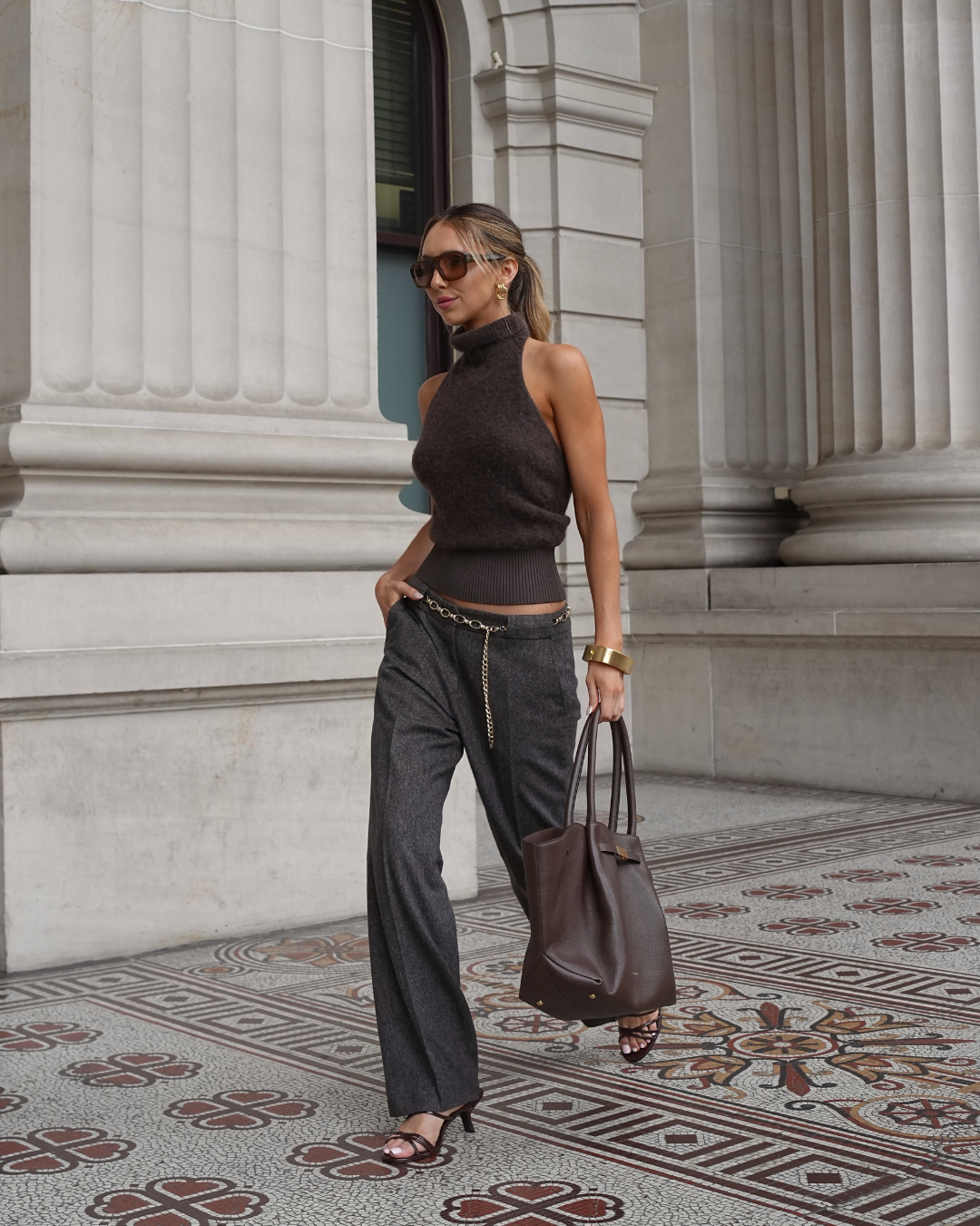
03ASignature layout
Hero split
Type anchors the left. Portrait breathes on the right.
Brand Feature Opportunity
Cool Girl
Wears.
Featuring
Sienna Espie
+ guest talent from the fashion community
Brand Guidelines · v1.0
Layout System
08
03BLayout rules
Structure and rhythm
The system should feel spacious, not empty.
01 · Grid
1320px max, 56px gutters.
All type aligns to a 56px left gutter. The image column can bleed beyond it to the right edge.
02 · Rhythm
Vertical spacing in fourths.
16, 24, 32, 40, 56, 72. Stick to this scale and avoid arbitrary values.
03 · Imagery
Full-body, on-location, architectural context.
Street-style portraits, 4:5 ratio, natural light. No white-room studio. Off-centre is preferred.
Cream, brown, hairlines, and whitespace do the brand work. Avoid decorative gradients, heavy borders, and overworked backgrounds.
Brand Guidelines · v1.0
Editorial Voice
09
04Voice and rules
Tone principles
Confident, unhurried, and tactile.
Never corporate. Never hype.
Do
Let whitespace do the work.
Generous margins. Short lines. Trust the reader to slow down.
Do
Use italic as emphasis.
Key nouns, brand names, and the one word that changes the sentence.
Don't
Stack caps, exclamations, emoji.
No all-caps body copy. No emoji in long-form editorial surfaces. Exclamation only if warranted.
Brand Guidelines · v1.0
Logo and Assets
10
05Logo system
Wordmark lockups
The classic mark is Cool Girl over Wears.
Rendered from the logo library. Playfair Display 400 is the base weight; roman tracking is approximately -5%, and the italic Wears. line is slightly tighter at approximately -6.5%. If the mark needs more presence, scale it larger rather than increasing the font weight.
A · Stacked centredHero lockup
B · Stacked leftMasthead lockup
C · Three-lineNarrow formats
D · Single lineFooters and signatures
E · Divided linePartnership and editorial applications
Wordmark settings
- Family: Playfair Display.
- Weight: 400 Regular for both lines.
- Italic: Wears. only, also 400 Regular Italic.
- Tracking: Cool Girl at -5%; Wears. at -6.5%.
Small-use exception
- The Monogram W uses Playfair Display Italic 500 Medium.
- Do not extend the 500 weight to headlines or the wordmark.
- For Canva: choose Regular, never Bold or Semibold, unless using the W monogram.
Brand Guidelines · v1.0
Logo and Assets
11
05BLogo formats
Social, avatar, and small-use marks
Use the format that fits the surface.
The full wordmark should lead wherever space allows. For avatars, favicons, story highlights, and small UI placements, use the dedicated compact marks from the logo set.
Final PNG and SVG assets are generated from Logo Set - Assets.html. Use the HTML/PDF here as the design reference, not as the downloadable asset source.
Brand Guidelines · v1.0
Designer Handoff
12
06Canva and production notes
Build from the tokens
Keep the brand warm, editorial, and unhurried.
Canva Brand Kit
- Colours: #F8EBDF, #633923, #F2DFCD, #7D5039, #4A2915, #D9A98E.
- Fonts: Playfair Display Regular, Playfair Display Regular Italic, Inter Regular, Inter Medium, Inter Semibold, JetBrains Mono Regular.
- Use the exact typography table above for Canva letter spacing and line spacing.
- Upload logo PNGs from the assets folder.
Creative Direction
- Street-level, real, warm, natural light.
- Use type, image, spacing, and hairlines before decoration.
- No gradients, no hype language, no corporate icon systems.
Source Package
- colors_and_type.css is the design-token source.
- preview/ contains component and typography examples.
- ui_kits/ contains marketing, shop, email, and mobile surfaces.
PDF Note
- This file is intentionally paginated for print.
- The original HTML remains best for scrolling review.
- Do not use the default Claude PDF export as the final handoff.